library(dplyr)
library(readr)
library(stringr)
library(ggplot2)
library(ggtext)
library(ggrepel)
library(ggbranding)
library(showtext)
library(AddFonts)
library(patchwork)
library(magick)

index <- read_csv("https://raw.githubusercontent.com/rfordatascience/tidytuesday/main/data/2026/2026-09-08/cappuccino_index.csv") |>
  # Two names contain non-breaking spaces need str_squish() --- see New Zealand
  mutate(country = str_squish(country))

# A café-menu display serif and sans, matching
title_font <- 'DM Serif Display'
main_font  <- 'DM Sans'
add_font(title_font)
add_font(main_font)
showtext_auto()
showtext_opts(dpi = 300)

bg_color <- '#ecdab7'   # crema: bg
ink      <- '#5B3A21'   # coffee: text, track, ticks, leaders
muted    <- '#735235'   # secondary text in the fit figure
accent   <- '#9C4F12'   # branding icons, fit-figure highlight

# Bean colors
region_colors <- c(
  'Europe'                    = '#2a78d6',
  'North America'             = '#e34948',
  'Latin America & Caribbean' = '#c98500',
  'Asia'                      = '#199e70',
  'Africa'                    = '#4a3aa7',
  'Oceania'                   = '#b0409a'
)The Cappuccino Index
TidyTuesday 2026-09-08
r
ggplot2
tidyverse
data-viz
Overview
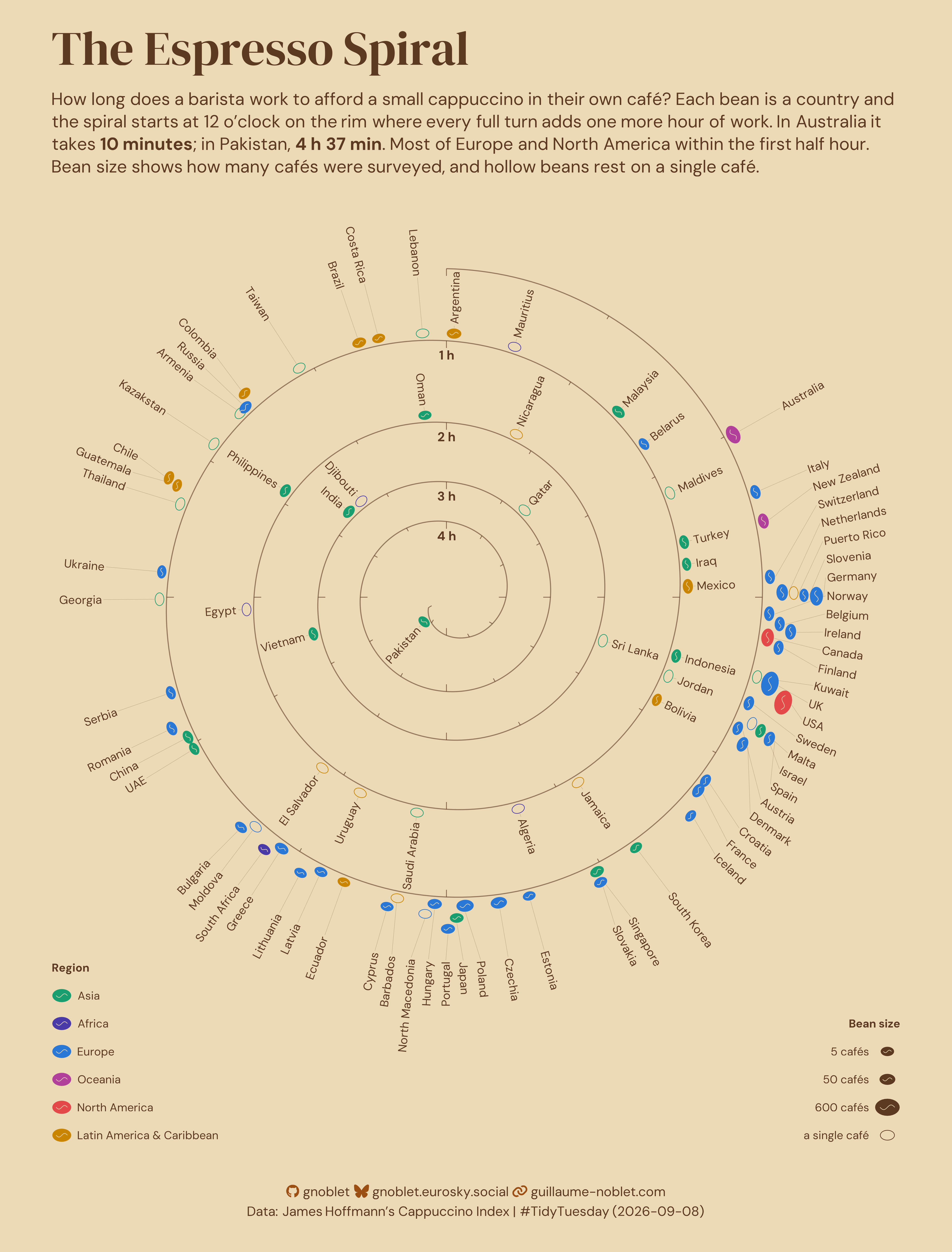
James Hoffmann is a YouTuber who explores coffee from many different angles. In a recent video he explored how long a barista would need to work to pay for a small cappuccino.
Curious how it’s built? The walkthrough below goes step by step.
Tip
Please cite, it’s nice! — Guillaume Noblet (2026). Tidy Tuesday Gallery. https://gnoblet.codeberg.page/TidyTuesday
Visualization
How it’s made
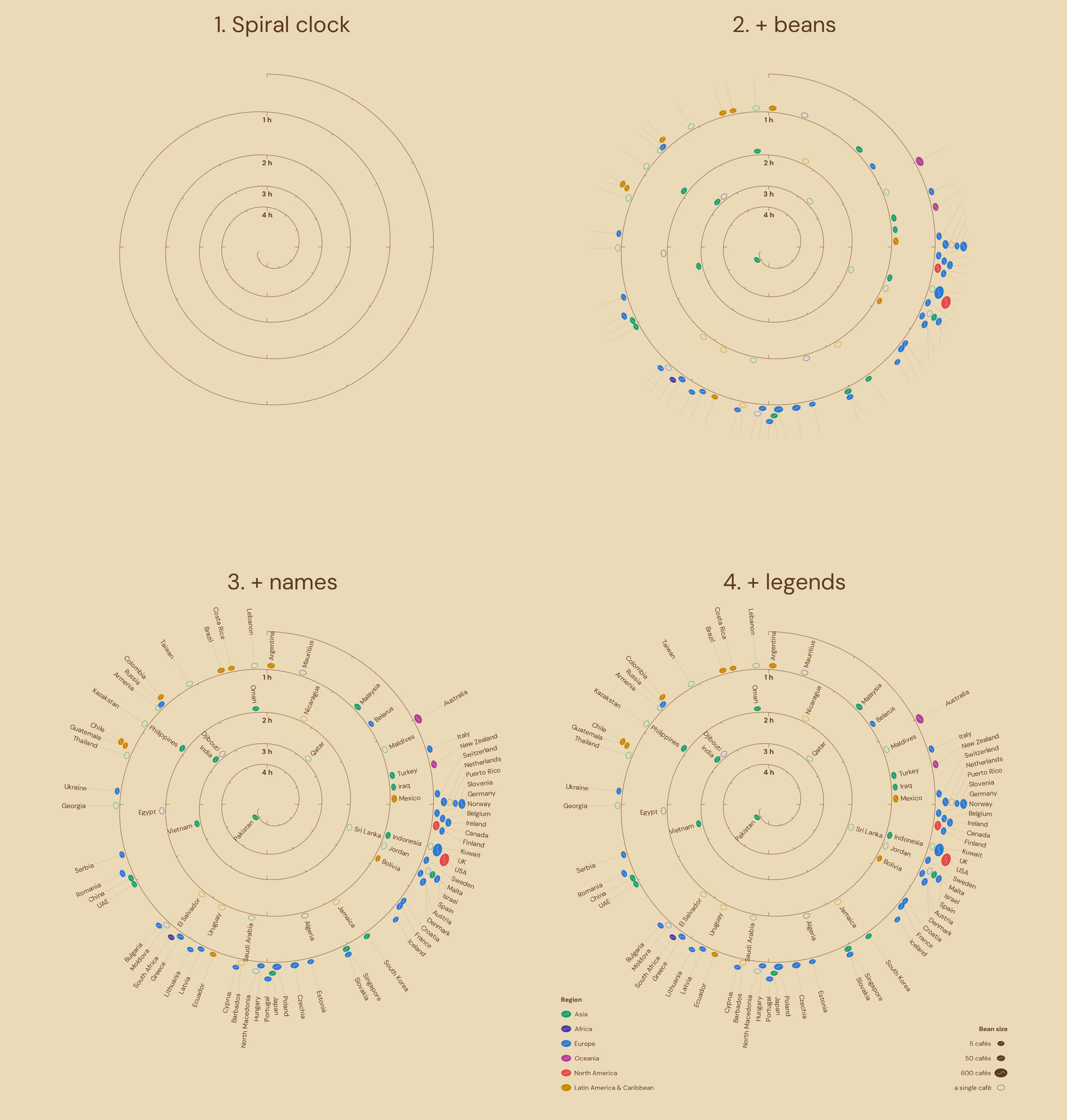
The idea. Every mark sits on a plain x–y plane: ggplot2 only ever draws polygons, segments and text, and the spiral is polar maths done by hand. A small layout engine places a bean and a name for each country, and an optimiser then sizes the spiral so that every name fits before the next turn. Figure 1 shows the chart coming together layer by layer.
1. Load
One row per country: index is the minutes of work a barista needs to afford a small cappuccino in their own café, n the number of cafés surveyed. Fonts and colours are set here, not with the plot, because the layout measures names in DM Sans and the explanatory figures reuse the palette.
2. Regions
Colour shows region, but the data only has country names. Natural Earth dataset has all countries’ continent and subregionm, hence matching on any of its three name columns catches most spellings, and replace_values() shortens and/or fix four of them. The Americas are then split into North vs Latin America & Caribbean, and three countries that Natural Earth are set by hand (Cyprus under Asia, the Maldives and Mauritius under “Seven seas”).
ne <- rnaturalearth::ne_countries(scale = "medium", returnclass = "sf") |>
  sf::st_drop_geometry()

# One row per spelling, so a join on `key` hits whichever one matches
lookup <- bind_rows(
  ne |> select(key = admin, continent, subregion),
  ne |> select(key = name, continent, subregion),
  ne |> select(key = name_long, continent, subregion)
) |>
  distinct(key, .keep_all = TRUE)

countries <- index |>
  mutate(key = replace_values(
    country,
    "UK"        ~ "United Kingdom",
    "USA"       ~ "United States of America",
    "UAE"       ~ "United Arab Emirates",
    "Kazakstan" ~ "Kazakhstan"
  )) |>
  left_join(lookup, by = join_by(key)) |>
  mutate(region = case_when(
    country == "Cyprus"                                                        ~ "Europe",
    country == "Maldives"                                                      ~ "Asia",
    country == "Mauritius"                                                     ~ "Africa",
    continent == "South America"                                               ~ "Latin America & Caribbean",
    continent == "North America" & subregion %in% c("Central America", "Caribbean") ~ "Latin America & Caribbean",
    continent == "North America"                                               ~ "North America",
    continent %in% c("Europe", "Asia", "Africa", "Oceania")                    ~ continent
  ))

#stopifnot(!anyNA(countries$region))
3. Units
ggplot2 sizes text in millimetres never in plot units. So we add a helper here to convert when drawing where \(s\) is in_per_unit below, 25.4 is the factor for an inch in mm, and \(u\) is a unit:
\[\text{mm} = u \times 25.4 \times s\]
The canvas width follows from the scale. Every country name is measured here in plot units. Changing in_per_unit scales the whole chart, and the fit in step 7, which only sees plot units, never needs retuning.
in_per_unit <- 5.6             # the chart's scale: 1 plot unit = 5.6 in
x_lim       <- c(-1.2, 1.38)   # plot window
margin_lr   <- 55              # left and right plot margins in pt
canvas_w    <- diff(x_lim) * in_per_unit + 2 * margin_lr / 72   # figure width in inches (72 pt per inch)

# In-panel text sizes, in plot units
u_to_mm     <- function(u) u * 25.4 * in_per_unit
name_size   <- 0.035   # country names
hour_size   <- 0.038   # 1 h ... 4 h marks
legend_size <- 0.034   # legend text

# get_cache_dir() is internal to AddFonts, and returns home folder "~/..."
# so we need to expand with path.expand
dm_sans  <- path.expand(file.path(AddFonts:::get_cache_dir(), "bunny-dm-sans-latin-400-normal.ttf"))
# Width in inches at the drawn size divided by the scale in plot units
name_len <- systemfonts::string_width(countries$country, path = dm_sans, size = u_to_mm(name_size) * .pt, res = 720) / 720 / in_per_unit
names(name_len) <- countries$country

spare      <- 0.01                   # room to spare before the next turn
half_thick <- name_size * 0.75 / 2   # half a name's height
4. Spiral clock
A time of \(m\) minutes sits at the following angle (12 o’clock at \(m = 0\), one clockwise turn per hour):
\[\theta(m) = \frac{\pi}{2} - \frac{2\pi m}{60}\]:
and at radius:
\[r(m) = 1 - \frac{1}{60}\int_0^m g(u)\,du\]
where \(g\) is the turn gap: how fast the radius shrinks in radius units per hour. If \(g\) were constant, consecutive turns would sit exactly \(g\) apart. Here \(g\) is set at six knots and linear in between, and its six values are fitted in step 7. The spiral runs to 280 min, just past the slowest country (Pakistan, 277).
m_max     <- 280                            # minutes
m_grid    <- seq(0, m_max, by = 0.25)
gap_knots <- seq(0, m_max, length.out = 6)  # 0, 56, 112, 168, 224, 280

track_theta <- function(m) pi / 2 - 2 * pi * m / 60

# r(m) for a given set of values
make_track_r <- function(gap) {
  rate <- approx(gap_knots, gap, xout = m_grid)$y
  r    <- 1 - c(0, cumsum((head(rate, -1) + tail(rate, -1)) / 2 * diff(m_grid))) / 60
  approxfun(m_grid, r, rule = 2)
}
5. Beans
Each country is a bean at its minute. Let’s have its width grows with the square root of cafés surveyed: \(w = 0.026 + 0.026\sqrt{n/600}\) (600 is the most, for the UK and the USA), and it is \(1.44\,w\) long. The first hour is crowded, so countries sharing a one-minute bin stack outward from the line. Inner turns are sparse, so beans that would overlap are nudged apart along the spiral instead.
Two tools do the work. spread_positions() pushes sorted positions apart until neighbours are at least gap apart. Along an arc of radius \(r\), one minute is \(2\pi r / 60\) long, which turns distances into minutes. place_beans() takes the radius function as an argument because the fit in step 7 re-runs it for every candidate spiral.
# Each pass moves every too-close pair apart by half the shortfall, until
# no pair is too close
spread_positions <- function(m, gap, iterations = 500) {
  p <- m
  for (it in seq_len(iterations)) {
    moved <- FALSE                         # did this sweep change anything?
    for (i in seq_along(p)[-1]) {          # each neighbouring pair (i - 1, i)
      d <- p[i] - p[i - 1]                 # their distance
      if (d < gap) {                       # if too close:
        shift  <- (gap - d) / 2            #   half the shortfall each
        p[i - 1] <- p[i - 1] - shift       #   the left one moves bac,
        p[i]     <- p[i] + shift           #   the right one moves forward
        moved  <- TRUE                     #   now exactly `gap` apart
      }
    }
    if (!moved) break                      # a clean sweep: every pair fits
  }
  p
}

bean_gap <- 0.004   # space between stacked beans in plot units


place_beans <- function(track_r) {
  countries |>
    arrange(index) |>
    mutate(w = 0.026 + 0.026 * sqrt(n / 600), ring = floor(index / 60) + 1) |>
    # m = drawn position, in minutes: exact on turn 1, nudged on inner turns
    mutate(
      m = if (first(ring) == 1) {
        index
      } else {
        spread_positions(index, (1.44 * max(w) + bean_gap) / (2 * pi * track_r(max(index)) / 60))
      },
      .by = ring
    ) |>
    mutate(bin = if_else(ring == 1, floor(index), 1000 + row_number())) |>
    mutate(
      stack_top = 0.006 + cumsum(w + bean_gap),
      stack_mid = stack_top - (w + bean_gap) / 2,
      .by = bin
    ) |>
    mutate(
      theta = track_theta(m),
      r     = track_r(m) + stack_mid,
      x0    = r * cos(theta),
      y0    = r * sin(theta)
    ) |>
    mutate(ring_top = max(stack_top), .by = ring)
}
6. Labels
Names run radially outward and they are spread along the arc so neighbours stay at least label_spacing apart, and a faint line links each name to its bean. On the left half the text is turned 180° so it never reads upside down, and right-aligned so it still starts next to the bean.
label_spacing <- 0.053   # min distance between names along the arc, plot units

place_labels <- function(beans, track_r) {
  beans |>
    mutate(offset = ring_top + 0.012) |>
    arrange(m) |>
    mutate(
      gap = label_spacing / (2 * pi * mean(track_r(m) + offset) / 60),
      pos = spread_positions(m, first(gap)),
      .by = ring
    ) |>
    mutate(
      r_lab  = track_r(pos) + offset,
      th_lab = track_theta(pos),
      x      = r_lab * cos(th_lab),
      y      = r_lab * sin(th_lab),
      deg    = th_lab * 180 / pi,
      left   = cos(th_lab) < 0,
      deg    = if_else(left, deg + 180, deg),
      hjust  = if_else(left, 1, 0),
      # Line: from the top of the bean's stack to just before the name
      lx     = (track_r(m) + stack_top) * cos(theta),
      ly     = (track_r(m) + stack_top) * sin(theta),
      lxend  = (r_lab - 0.006) * cos(th_lab),
      lyend  = (r_lab - 0.006) * sin(th_lab)
    )
}
7. Fit
An inner name grows outward toward the turn above. Between its turn and the next one out, it needs room for a small gap, the name itself, a little room to spare, and a tick’s length if a tick sits right there. The room it has is \(r(m-60) - r(m)\), the distance to the same angle one turn out. optim() searches for the six knot values that minimise
\[\big(1 - r(280)\big) \;+\; 2000\sum_i \max(0,\ \text{need}_i - \text{room}_i)^2 \;+\; 0.02\sum_k (g_{k+1} - g_k)^2\]
That is the radius used, plus a heavy penalty for any name without room and a light one for abrupt changes between knots. Two checks stop the render if a name doesn’t fit or the spiral reaches the centre.
# Need and room for every inner name, for a given radius function
name_room <- function(track_r) {
  place_beans(track_r) |>
    filter(ring > 1) |>
    place_labels(track_r) |>
    mutate(
      above  = pos - 60,              # same angle, one turn out
      tick_m = 5 * round(above / 5),  # nearest tick on that turn
      near   = abs(above - tick_m) * 2 * pi * track_r(above) / 60 < half_thick + 0.004,
      tick   = if_else(near, if_else(tick_m %% 15 == 0, 0.022, 0.011), 0),
      need   = offset + name_len[country] + tick + spare,
      room   = track_r(above) - track_r(pos)
    )
}

shortfall <- function(gap) with(name_room(make_track_r(gap)), need - room)

fit <- optim(
  par    = rep(0.2, length(gap_knots)),
  fn     = function(gap) {
    (1 - make_track_r(gap)(m_max)) + 2000 * sum(pmax(shortfall(gap), 0)^2) + 0.02 * sum(diff(gap)^2)
  },
  method = "L-BFGS-B", lower = 0.09, upper = 0.5   # a gap never narrower than a bean
)
gap_ctrl <- fit$par

stopifnot(
  max(shortfall(gap_ctrl)) < 0.001,        # every name fits (within 0.001 plot units)
  make_track_r(gap_ctrl)(m_max) > 0.03     # the spiral ends short of the centre
)

# The final layout, on the fitted spiral
track_r <- make_track_r(gap_ctrl)
beans   <- place_beans(track_r)
labels  <- place_labels(beans, track_r)
8. Clock face
The track is the spiral itself, drawn through the quarter-minute grid. Ticks mark every 5 minutes, then longer every 15. Each hour mark hangs centred under its 12 o’clock tick.
track <- tibble(m = m_grid) |>
  mutate(x = track_r(m) * cos(track_theta(m)), y = track_r(m) * sin(track_theta(m)))

ticks <- tibble(m = seq(0, m_max, by = 5)) |>
  mutate(
    len = if_else(m %% 15 == 0, 0.022, 0.011),
    x   = track_r(m) * cos(track_theta(m)),
    y   = track_r(m) * sin(track_theta(m)),
    xend = (track_r(m) - len) * cos(track_theta(m)),
    yend = (track_r(m) - len) * sin(track_theta(m))
  )

hour_marks <- tibble(h = 1:4) |>
  mutate(x = 0, y = track_r(60 * h) - 0.03, label = paste(h, "h"))
9. Glyphs
A bean is an ellipse with semi-axes \(a = 0.72\,w\) (along the spiral) and \(b = 0.5\,w\): the points \((a\cos t,\ b\sin t)\) are rotated to the bean’s direction and moved to its centre. Its crease is an S-curve along the long axis: for \(u\) running over the middle 60% of the bean, the sideways offset is:
\[v = 0.28\,b\,\sin\!\left(\frac{\pi u}{0.6\,a}\right)\]
That is one full sine period, so the line swings to one side and then the other.
ellipse_polygon <- function(x0, y0, a, b, angle, n_pts = 28) {
  t <- seq(0, 2 * pi, length.out = n_pts + 1)[-1]
  tibble(
    x = x0 + a * cos(t) * cos(angle) - b * sin(t) * sin(angle),
    y = y0 + a * cos(t) * sin(angle) + b * sin(t) * cos(angle)
  )
}

# theta + pi / 2 is the spiral's direction at the bean
bean_polys <- beans |>
  reframe(
    ellipse_polygon(x0, y0, a = 0.72 * w, b = 0.5 * w, angle = theta + pi / 2),
    .by = c(country, region, n)
  )

bean_creases <- beans |>
  reframe(
    {
      a <- 0.72 * w
      b <- 0.5 * w
      u <- seq(-0.6 * a, 0.6 * a, length.out = 15)
      v <- 0.28 * b * sin(pi * u / (0.6 * a))
      ang <- theta + pi / 2
      tibble(x = x0 + u * cos(ang) - v * sin(ang), y = y0 + u * sin(ang) + v * cos(ang))
    },
    .by = country
  )
10. Text
The subtitle get its info from from the data (fastest and slowest country). The caption is built with my own wonderful first version of ggbranding. Countries with single café surveyed are very very very much fragile estimate, so those beans are drawn with the country color’s outline.
fastest <- countries |> slice_min(index, n = 1)
slowest <- countries |> slice_max(index, n = 1)

title <- 'The Espresso Spiral'

# ggtext wraps at any Unicode space, even a non-breaking one, so to
# keep a phrase on one line its spaces become transparent dots of similar width
nobreak <- function(x) str_replace_all(x, " ", "<span style='color:transparent'>.</span>")

subtitle <- str_glue(
  "How long does a barista work to afford a small cappuccino in their own café? ",
  "Each bean is a country and the spiral starts at 12 o'clock on the rim where every full turn adds one more hour of work. ",
  "In {fastest$country} it takes **{nobreak(paste(round(fastest$index), 'minutes'))}**; ",
  "in {slowest$country}, **{nobreak(paste(floor(slowest$index / 60), 'h', round(slowest$index %% 60), 'min'))}**. ",
  "Most of Europe and North America within the first half hour. ",
  "Bean size shows how many cafés were surveyed, and hollow beans rest on a single café."
)

caption <- branding(
  github = 'gnoblet', bluesky = 'gnoblet.eurosky.social', website = 'guillaume-noblet.com',
  additional_text = "Data: James Hoffmann's Cappuccino Index | #TidyTuesday (2026-09-08)",
  text_position = 'after', line_spacing = 2L,
  text_color = ink, icon_color = accent, additional_text_color = ink,
  text_size = '16pt', icon_size = '16pt', additional_text_size = '16pt'
)

bean_polys <- bean_polys |>
  mutate(
    fill_col = if_else(n == 1, bg_color, region_colors[region]),
    line_col = if_else(n == 1, region_colors[region], NA_character_)
  )
11. Legends
The legend is drawn by hand with the same bean glyph as the data: two vertical columns in the lower corners, since there is space with country names going upwards on the spiral on the corners. Regions are listed from the shortest name to the longest.
legend_row    <- 0.085   # row height, plot units
legend_bottom <- -1.68   # bottom edge of both columns, plot units

# One column: a bold title on top, then one row per item.
# side = "left" puts beans on the left edge with text to their right;
# "right" mirrors it
legend_column <- function(title, labels, w, fill, line, side) {
  edge  <- if (side == "left") x_lim[1] else x_lim[2]
  dir   <- if (side == "left") 1 else -1   # from the edge into the plot
  hjust <- if (side == "left") 0 else 1
  half  <- 0.72 * max(w)                   # half-length of the largest bean
  rows  <- tibble(label = labels, w = w, fill_col = fill, line_col = line) |>
    mutate(h = if_else(str_detect(label, "\n"), 1.6, 1) * legend_row)
  top   <- legend_bottom + legend_row + sum(rows$h)
  list(
    items = rows |>
      mutate(
        y0    = top - legend_row - (cumsum(h) - h / 2),
        x0    = edge + dir * half,
        x_lab = edge + dir * (2 * half + 0.02),
        hjust = hjust
      ),
    title = tibble(x = edge, y = top - legend_row / 2, label = title, hjust = hjust)
  )
}

region_order <- names(region_colors)[order(systemfonts::string_width(names(region_colors), path = dm_sans, size = u_to_mm(legend_size) * .pt))]
region_legend <- legend_column(
  'Region', region_order,
  w = 0.04, fill = unname(region_colors[region_order]), line = NA_character_, side = 'left'
)
size_legend <- legend_column(
  'Bean size', c('5 cafés', '50 cafés', '600 cafés', 'a single café'),
  w    = c(0.026 + 0.026 * sqrt(c(5, 50, 600) / 600), 0.03),
  fill = c(rep(ink, 3), bg_color),
  line = c(rep(NA_character_, 3), ink),
  side = 'right'
)

legend_items  <- bind_rows(region_legend$items, size_legend$items) |> mutate(item = row_number())
legend_titles <- bind_rows(region_legend$title, size_legend$title)

legend_beans <- legend_items |>
  reframe(ellipse_polygon(x0, y0, a = 0.72 * w, b = 0.5 * w, angle = 0), .by = c(item, fill_col, line_col))

legend_creases <- legend_items |>
  reframe(
    {
      u <- seq(-0.6 * 0.72 * w, 0.6 * 0.72 * w, length.out = 15)
      tibble(x = x0 + u, y = y0 + 0.28 * 0.5 * w * sin(pi * u / (0.6 * 0.72 * w)))
    },
    .by = item
  )
12. Compose
The plot is four groups of layers, drawn in this order: the clock face, the beans (leaders first, so beans sit on top of them), the names, and the legends. Colours are pre-computed, so identity scales pass them straight through. The window is offset from the spiral’s centre because the names bulge right (the deep stacks at 14–18 min) and down (long names at the bottom), and the legends sit in its lower corners.
clock_layers <- list(
  geom_path(data = track, aes(x, y), colour = ink, alpha = 0.6, linewidth = 0.6),
  geom_segment(data = ticks, aes(x, y, xend = xend, yend = yend), colour = ink, alpha = 0.7, linewidth = 0.45),
  geom_text(data = hour_marks, aes(x, y, label = label), colour = ink, size = u_to_mm(hour_size), fontface = 'bold', vjust = 1, family = main_font)
)

bean_layers <- list(
  geom_segment(data = labels, aes(x = lx, y = ly, xend = lxend, yend = lyend), colour = ink, alpha = 0.3, linewidth = 0.2),
  geom_polygon(data = bean_polys, aes(x, y, group = country, fill = fill_col, colour = line_col), linewidth = 0.35),
  geom_path(data = bean_creases, aes(x, y, group = country), colour = bg_color, linewidth = 0.3)
)

label_layers <- list(
  geom_text(data = labels, aes(x, y, label = country, angle = deg, hjust = hjust), colour = ink, size = u_to_mm(name_size), family = main_font)
)

legend_layers <- list(
  geom_polygon(data = legend_beans, aes(x, y, group = item, fill = fill_col, colour = line_col), linewidth = 0.35),
  geom_path(data = legend_creases, aes(x, y, group = item), colour = bg_color, linewidth = 0.3),
  geom_text(data = legend_items, aes(x_lab, y0, label = label, hjust = hjust), colour = ink, size = u_to_mm(legend_size), lineheight = 0.9, family = main_font),
  geom_text(data = legend_titles, aes(x, y, label = label, hjust = hjust), colour = ink, size = u_to_mm(legend_size), family = main_font, fontface = 'bold')
)

# Shared by the plot
frame <- list(
  scale_fill_identity(),
  scale_colour_identity(),
  coord_fixed(xlim = x_lim, ylim = c(-1.73, 1.16), expand = FALSE, clip = 'off'),
  theme_void()
)

p <- ggplot() +
  clock_layers + bean_layers + label_layers + legend_layers +
  frame +
  labs(title = title, subtitle = subtitle, caption = caption) +
  theme(
    plot.background        = element_rect(fill = bg_color, colour = NA),
    plot.margin            = margin(40, margin_lr, 40, margin_lr),
    plot.title.position    = 'plot',
    plot.caption.position  = 'plot',
    plot.title = element_textbox_simple(
      family = title_font, size = 58, colour = ink, margin = margin(b = 20)
    ),
    plot.subtitle = element_textbox_simple(
      family = main_font, size = 21, colour = ink, lineheight = 1.3, margin = margin(b = 48)
    ),
    plot.caption = element_textbox_simple(
      family = main_font, colour = ink, halign = 0.5, margin = margin(t = 24)
    ),
    legend.position        = 'none'
  )
13. Export
The PNG is canvas_w width.
ggsave(
  'week_36.png',
  plot   = p,
  width  = canvas_w,
  height = 21,     # in, see above
  dpi    = 300,
  bg     = bg_color
)

image <- image_read('week_36.png')
image <- image_scale(image, geometry_size_pixels(width = 500, preserve_aspect = TRUE))
image_write(image, 'week_36_thumb.png', format = 'png')