from hdx.utilities.easy_logging import setup_logging
from hdx.api.configuration import Configuration
from hdx.data.dataset import Dataset
import pandas as pdDay 19: Smooth
This time, I’ll plot the World Food Programme Prices data. First, we get data from the ’‘’Global WFP Food Prices’’ dataset from the HDX API. and remove the first row which contains tags.
# setup
setup_logging()
Configuration.create(
  hdx_site = "prod",
  user_agent="@gnoblet_30DayChartChallenge",
  hdx_read_only = True)

dataset = Dataset.read_from_hdx("global-wfp-food-prices")
url = dataset.get_resource()['url']

# get csv from url
df = pd.read_csv(url, dtype = str)

# remove first row
df = df.iloc[1:]
Let’s keep only Sub-Saharan countries in the West African region (using XOF, recorded as such in the dataset). Let’s also focus on the local prices for rice.
# keep only Sub-Saharan countries curreency being set to XOF
df = df[df['currency'] == 'XOF']

# keep only local prices for rice
df = df[df['commodity_id'] == '71']
There is some needed data wrangling now since there are different units, and in particular where the unit is 1KG, only KG is written in column ‘unit’.
# split at the first space
splits = df['unit'].str.split(' ', n = 1, expand=True)

# If the first part is not numeric, move it to the second part and set the first to '0'
mask_text_only = ~splits[0].str.isnumeric()
splits.loc[mask_text_only, 1] = splits.loc[mask_text_only, 0]
splits.loc[mask_text_only, 0] = '1'

# Fill NaN in the second part with None or ''
splits[1] = splits[1].fillna('')

# Assign columns
df['div'] = splits[0].astype(int)
df['unit_only'] = splits[1]

# price as double
df['price'] = df['price'].astype(float)

# case_when
# if unit_only is KG, divide price by div
# if unit_only is marmite, divide price by 2.5 (FAO: marmite is 2.5kg, seems to be in Haiti only, can be removed eventually since HTI is not XOF)
df['price_kg'] = df.apply(lambda x: x['price'] / x['div'] if x['unit_only'] == 'KG' else x['price'] / 2.5, axis=1)
Now, before I move on to plot, I want to get the median price by country and date, and get neat country names. For this, I need to convert the date column to datetime, summarize and get unique median price by countryiso3 and date, and add country names from a wonderful iso dictionary.
df['date'] = pd.to_datetime(df['date'])
df = df.sort_values('date')

# summarize and get unique median price by countryiso3 and date
df = df.groupby(['countryiso3', 'date'])['price_kg'].median().reset_index()
# add country names from iso dictionary
iso = {
'BEN': 'Benin',
'BFA': 'Burkina Faso',
'CIV': 'Ivory Coast',
'GNB': 'Guinea-Bissau',
'MLI': 'Mali',
'NER': 'Niger',
'SEN': 'Senegal',
'TGO': 'Togo'
}
df['country_name'] = df['countryiso3'].map(iso)On to the plot! Using seaborn now we will plot time series of prices using small multiples by country. Let’s load the packages needed and set up the theme.
# load libraries
import seaborn as sns
import matplotlib.dates as mdates
import textwrap
import matplotlib.pyplot as plt
from pyfonts import load_google_font, set_default_font

# load Carlito via pyfonts and set it as the global matplotlib font
body_font = load_google_font("Carlito")
set_default_font(body_font)

# set up a theme
sns.set_theme(
    style = 'whitegrid',
    rc = {
        "grid.linewidth": 0.3,
        'figure.figsize':(9,6)
    }
)
There are only eight countries in this dataset. I add dummy rows to be able to plot empty countries first that will leave space for the plot title on the basis of a 3-column row. There may very well be more elegant solutions but I couldn’t find any.
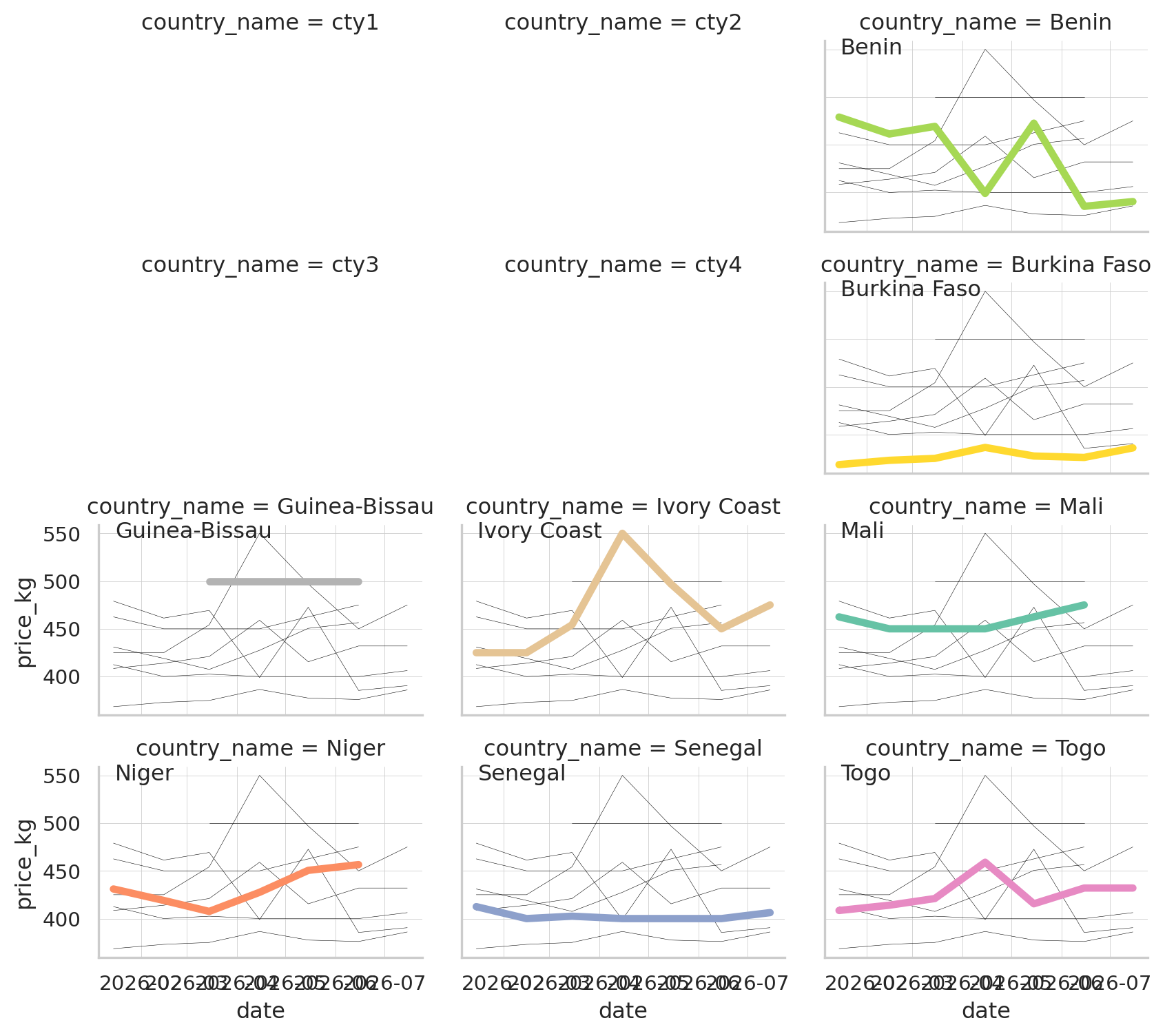
The plot follows this structure: - use sns.relplot to plot each year’s time series in its own facet; - loop through each facet to add all countries except the dummy ones.
# add dummy rows to plot empty countries first: four dummies form a
# 2-column x 2-row blank block in the top-left (reserved for the title),
# leaving column 3 of rows 1-2 free for the first two countries
dummy_names = ['cty1', 'cty2', 'cty3', 'cty4']
dummy_rows = pd.DataFrame({
    'date': [df['date'].min()] * len(dummy_names),
    'price_kg': [None] * len(dummy_names),
    'country_name': dummy_names
})
df2 = pd.concat([dummy_rows, df], ignore_index=True)

# interleave the dummy block with country data so it renders as a clean
# 2x2 rectangle: dummy, dummy, country / dummy, dummy, country / then the
# remaining countries fill full rows
countries_sorted = sorted(df['country_name'].unique())
col_order = (
    dummy_names[0:2] + countries_sorted[0:1] +
    dummy_names[2:4] + countries_sorted[1:2] +
    countries_sorted[2:]
)

# plot each year's time series in its own facet
g = sns.relplot(
    data = df2,
    x = "date",
    y = "price_kg",
    col = "country_name",
    hue = "country_name",
    kind = "line",
    palette = "Set2",
    linewidth = 4,
    zorder = 5,
    col_wrap = 3,
    height = 2,
    aspect = 1.5,
    legend = False,
    col_order = col_order
)
# loop through each facet
for country_name, ax in g.axes_dict.items():
    if country_name in dummy_names:
        # Hide axes for dummy facets
        ax.axis('off')
    else:
        # Your normal plotting code
        ax.text(.05, .93, country_name, transform = ax.transAxes)
        sns.lineplot(
            data = df2[df2['country_name'] != country_name],
            x = "date",
            y = "price_kg",
            units = "country_name",
            estimator = None,
            color = "black",
            linewidth = 0.2,
            ax = ax
        )
Now that I got the base plot, I can add some nice touches. First, I want to set the x-axis to show only years, remove titles and set the y-axis label to XOF.
# format x-axis to show only years
for ax in g.axes.flatten():
    ax.xaxis.set_major_locator(mdates.YearLocator())
    ax.xaxis.set_major_formatter(mdates.DateFormatter('%Y'))
    for label in ax.get_xticklabels():
        label.set_rotation(0)
        label.set_horizontalalignment('center')
    # Enable grid only for major ticks (years)
    ax.grid(which='major', axis='x', linestyle='-', linewidth=0.2)

# tweak the supporting aspects of the plot
g.set_titles("")
g.set_axis_labels("", "XOF")
Second, it’s time to set titles, caption, etc.
# some layout style aka titles and caption
palette = sns.color_palette("Set2")
title_color = palette[0]
title = "How smooth are changes in local rice prices in Western Sub-Saharan Africa?"
subtitle = "The graph displays median prices of local rice for 8 sub-saharan countries from 2022 to today, where XOF is the main currency."
caption = "Data: HDX - WFP Food Prices | Viz: @gnoblet"
# wrap characters and then add text
title_w = "\n".join(textwrap.wrap(title, width = 30))
subtitle_w = "\n".join(textwrap.wrap(subtitle, width = 50))

# the title block occupies the top 2 rows of facets (the dummy 2x2 block):
# derive the row/column bands from the actual grid shape so it stays
n_rows = -(-len(g.col_names) // 3)
row1_top, row1_bottom = 1, 1 - 1 / n_rows
row2_top, row2_bottom = row1_bottom, 1 - 2 / n_rows

title_y = (row1_top + row1_bottom) / 2  # vertical center of row 1
subtitle_y = row2_top - 0.25 * (row2_top - row2_bottom)
caption_y = row2_top - 0.60 * (row2_top - row2_bottom)

g.figure.text(
    0.05, title_y, title_w, fontsize = 26, color = title_color, font = body_font,
    ha = "left", va = "center", multialignment = "left"
)
g.figure.text(0.05, subtitle_y, subtitle_w, fontsize = 18, color = 'black', wrap = True, font = body_font)
g.figure.text(0.05, caption_y, caption, fontsize = 16, color = 'black', wrap = True, font = body_font)
Text(0.05, 0.6, 'Data: HDX - WFP Food Prices | Viz: @gnoblet')Now, we eventually would like to save this plot.
# save plot
g.figure.savefig('day_19.png', dpi = 300, bbox_inches = 'tight')
plt.show()
# close plot
plt.close()
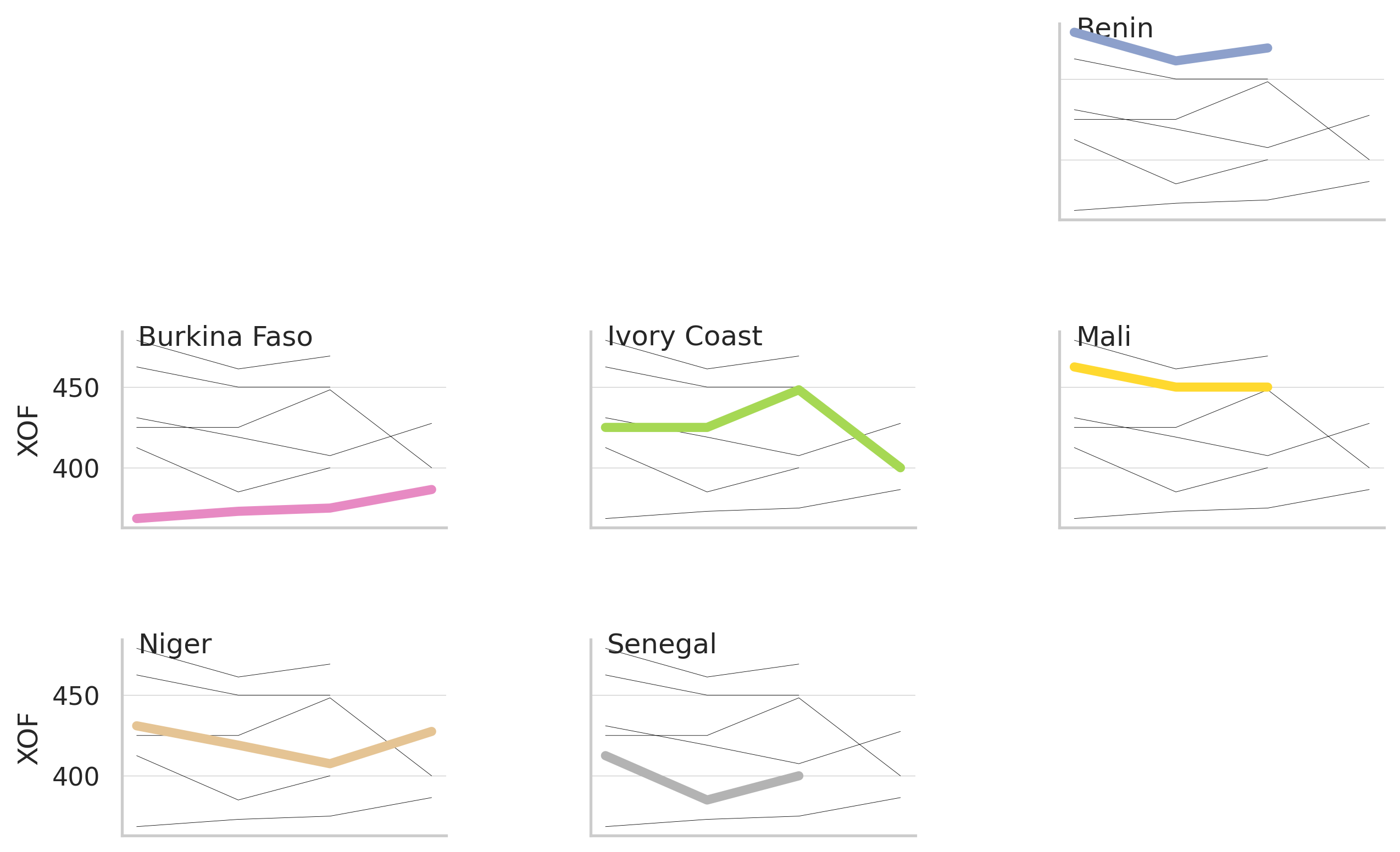
Final Plot
Notes
This visualization shows the evolution of local rice prices across eight West African countries that use XOF as their currency.
Data source: World Food Programme Food Prices dataset (via Humanitarian Data Exchange API)
Tools used: - hdx (for accessing the Humanitarian Data Exchange API) - pandas (for data manipulation) - seaborn (for visualization) - matplotlib (for plot customization) - pyfonts (to get Fonts)
The visualization employs small multiples (faceted plots) to compare price trends across countries while maintaining context with faint background lines showing other countries’ trends. The analysis addresses data quality issues by standardizing units (converting to price per kg) and calculating median prices by country and date to smooth inconsistencies in the original data.