library(owidapi)
library(ggplot2)
library(data.table)
library(geofacet)
library(showtext)
library(sysfonts)
library(ggtext)


# Retrieve life satisfaction distribution data from OWID
dat  <- owid_get(
  chart_id = "happiness-cantril-ladder"
)
setDT(dat)

# i want to keep only african countries:
data("africa_countries_grid1", package = "geofacet")
cty <- africa_countries_grid1

# recode differently names countries
dat <-  dat[, entity_name := fcase(
  entity_name == "Democratic Republic of Congo" , "Democratic Republic of the Congo",
  entity_name == "Cote d'Ivoire", "Côte d'Ivoire",
  entity_name == "Congo", "Republic of the Congo",
  default = entity_name
)]

# merge and remove empty codes
dat_cty <- dat[cty, on = .(entity_name = name)][!is.na(code)]
dat_cty[, avg_score := mean(cantril_ladder_score, na.rm = TRUE), by = year]

#------ Colors and fonts
font_add_google("Nunito", "Nunito")
showtext_auto()
showtext_opts(dpi = 600)


body_font <- "Nunito"
title_font <- "Nunito"
col_fill <- "#00CFC8"
col_line <- "#112D4E"
panel_bg_col <- "#F0F0F0"
bg_col <- "#FFFFFF"
text_col <- "#2A2A2A"

# Updated tag with engaging explanation

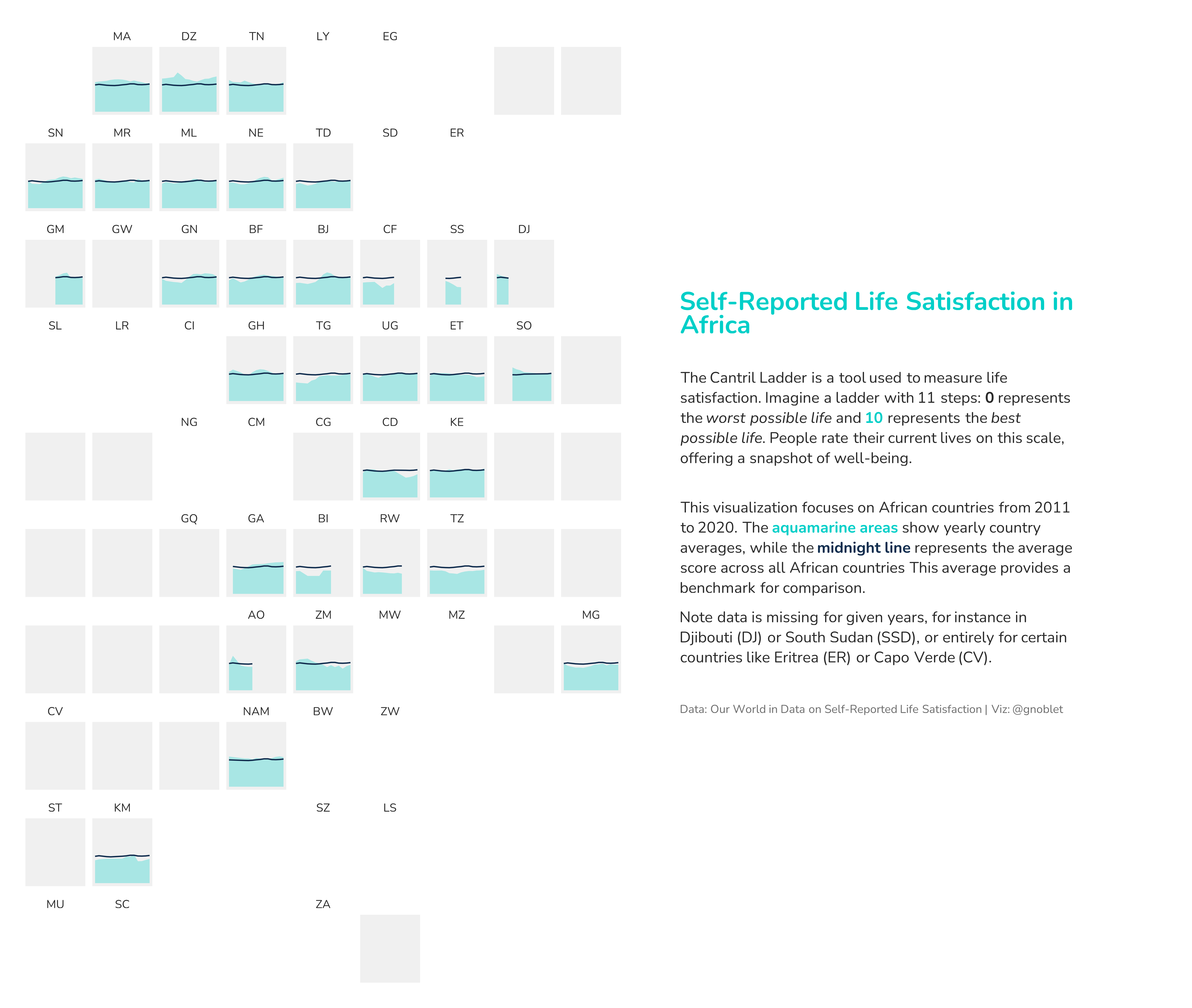
tag <- "
  <span style='font-size:20pt;color:#00CFC8;'>**Self-Reported Life Satisfaction in Africa**</span><br>

  <span style='font-size:12pt;color:#2A2A2A;'>The Cantril Ladder is a tool used to measure life satisfaction. Imagine a ladder with 11 steps: <span style='color:#2A2A2A;'>**0**</span> represents the *worst possible life* and <span style='color:#00CFC8;'>**10**</span> represents the *best possible life*. People rate their current lives on this scale, offering a snapshot of well-being.</span><br>

  <span style='font-size:12pt;color:#2A2A2A;'>This visualization focuses on African countries from 2011 to 2025. The <span style='color:#00CFC8;'>**aquamarine areas**</span> show yearly country averages, while the <span style='color:#112D4E;'>**midnight line**</span> represents the average score across all African countries This average provides a benchmark for comparison.</span>

  <span style='font-size:12pt;color:#2A2A2A;'> Note data is missing for given years, for instance in Djibouti (DJ) or South Sudan (SS), or entirely for certain countries like Eritrea (ER) or Capo Verde (CV).<br>

  <span style='font-size:9pt;color:#6D6D6D;'>Data: Our World in Data on Self-Reported Life Satisfaction | Viz: @gnoblet</span>
"

g <- ggplot(dat_cty, aes(x = year, y = cantril_ladder_score, group = code)) +
  geom_area(fill = col_fill, alpha = 0.3) +
  geom_line(aes(y = avg_score), color = col_line, linewidth = 0.5) +
  labs(
    tag = tag,
    x = NULL,
    y = NULL
  ) +
  scale_y_continuous(limits = c(0, 10)) +
  theme_minimal() +
  facet_geo(~ code, grid = "africa_countries_grid1") +
  theme(
    text = element_text(family = body_font, color = text_col),
    axis.text = element_blank(),
    panel.background = element_rect(fill = panel_bg_col, color = NA),
    plot.background = element_rect(fill = bg_col, color = NA),
    panel.grid = element_blank(),
    plot.margin = margin(20,450, 20, 20),
    plot.tag.position = c(1.1, 0.5),
    plot.tag = element_textbox_simple(
      width = unit(4.3, "inch"),
      lineheight = 1.2,
      hjust = 0,
      maxwidth = 1
    ),
    strip.text = element_text(color = text_col, size = 9)
  )

# save
ggsave(
  "day_09.png",
  dpi = 600,
  width = 13,
  height = 11
)