library(rio)
library(data.table)
library(ggplot2)
library(showtext)
library(sysfonts)
library(patchwork)
library(ggtext)
library(owidapi)
library(scico)
library(refugees)
library(paletteer)

# Add Nunito font
font_add_google(name = "Nunito", family = "Nunito")

# Load and preprocess data
dat <- refugees::idmc
iso <- refugees::countries
setDT(dat)
dat <- dat[year == 2024]
dat <- merge(dat, iso, by.x = "coa_iso", by.y = "iso_code")

# Merge population data
pop <- owid_get("population")
setDT(pop)
pop <- pop[year == 2023 & entity_id != ""]
dat <- merge(dat, pop, by.x = "coa_iso", by.y = "entity_id")

# Calculate IDP proportion per population
dat[, prop := total / population_historical]

# State of Palestine to Palestinee
# Syrian Arab Rep. to Syria
# Dem. Rep. of the Congo to Congo Kinshasa
dat[name == "State of Palestine", name := "Palestine"]
dat[name == "Syrian Arab Rep.", name := "Syria"]
dat[name == "Dem. Rep. of the Congo", name := 'Congo Kinshasa']

# Function to prepare top data and calculate angles
prepare_top_data <- function(data, column, top_n = 30) {
  setorderv(data, column, order = -1)
  top_data <- data[1:top_n]
  top_data[, id := 1:.N]
  top_data[, coa_iso := factor(coa_iso, levels = coa_iso)]

  angle <- 90 - 360 * (top_data$id - 0.5) / nrow(top_data)
  top_data[, hjust := ifelse(angle < -90, 1, 0)]
  top_data[, angle := ifelse(angle < -90, angle + 180, angle)]

  return(top_data)
}

top10_total <- prepare_top_data(dat, "total")
top10_prop <- prepare_top_data(dat, "prop")

# Function to create circular bar plots
create_circular_plot <- function(data, y_column, fill_label, lab_f) {
  ggplot(data, aes(x = id, y = get(y_column), fill = get(y_column))) +
    geom_col(alpha = 0.8, width = 1) +
    coord_polar() +
    scale_y_continuous(
      limits = c(0, max(data[[y_column]]) * 1.2),
      expand = expansion(mult = c(0.2, 0))
    ) +
    geom_text(
      data = data[1:12],
      aes(
        y = get(y_column) + (max(get(y_column)) * 0.05),
        label = name,
        hjust = hjust
      ),
      color = "black",
      size = 4,
      angle = data$angle[1:12],
      family = 'Nunito'
    ) +
    theme_minimal(base_family = 'Nunito') +
    labs(x = NULL, y = NULL, fill = fill_label) +
    theme(
      axis.text = element_blank(),
      panel.grid = element_blank(),
      plot.background = element_rect(fill = "white", color = NA),
      legend.position = c(0.5, 0.1),
      legend.title = element_text(size = 12),
      legend.text = element_text(size = 10),
      plot.margin = margin(t = 10, b = 0)
    ) +
    scale_fill_paletteer_c(
      "scico::acton",
       direction = -1,
       na.value = "lightgray",
       labels = lab_f,
       guide = guide_colorbar(
         direction = "horizontal", # Horizontal layout
         title.position = "top",
         title.hjust = 0.5,
         label.position = "bottom",
         label.hjust = 0.5,
         nrow = 1,
         keywidth = unit(150, "pt"),  # Balanced key size
   ))
}


p1 <- create_circular_plot(top10_total, "total", "Number of IDPs", lab_f = scales::label_number(scale_cut = scales::cut_short_scale()))
p2 <- create_circular_plot(top10_prop, "prop", "Proportion of IDPs", lab_f = scales::label_percent(accuracy = 1))

# Create final layout
final_layout <- (p1 + p2) +
  plot_layout(widths = c(1, 1)) +
  plot_annotation(
    title = "<b style='font-size:35px; color:#260C3F;'>The Global Displacement Crisis (2024)</b><br>
              <span style='font-size:26px; color:#585380;'>Two Metrics to Visualize Internally Displaced Persons (IDPs) </span><br><br>
              <span style='font-size:18px; color:#404040;'>
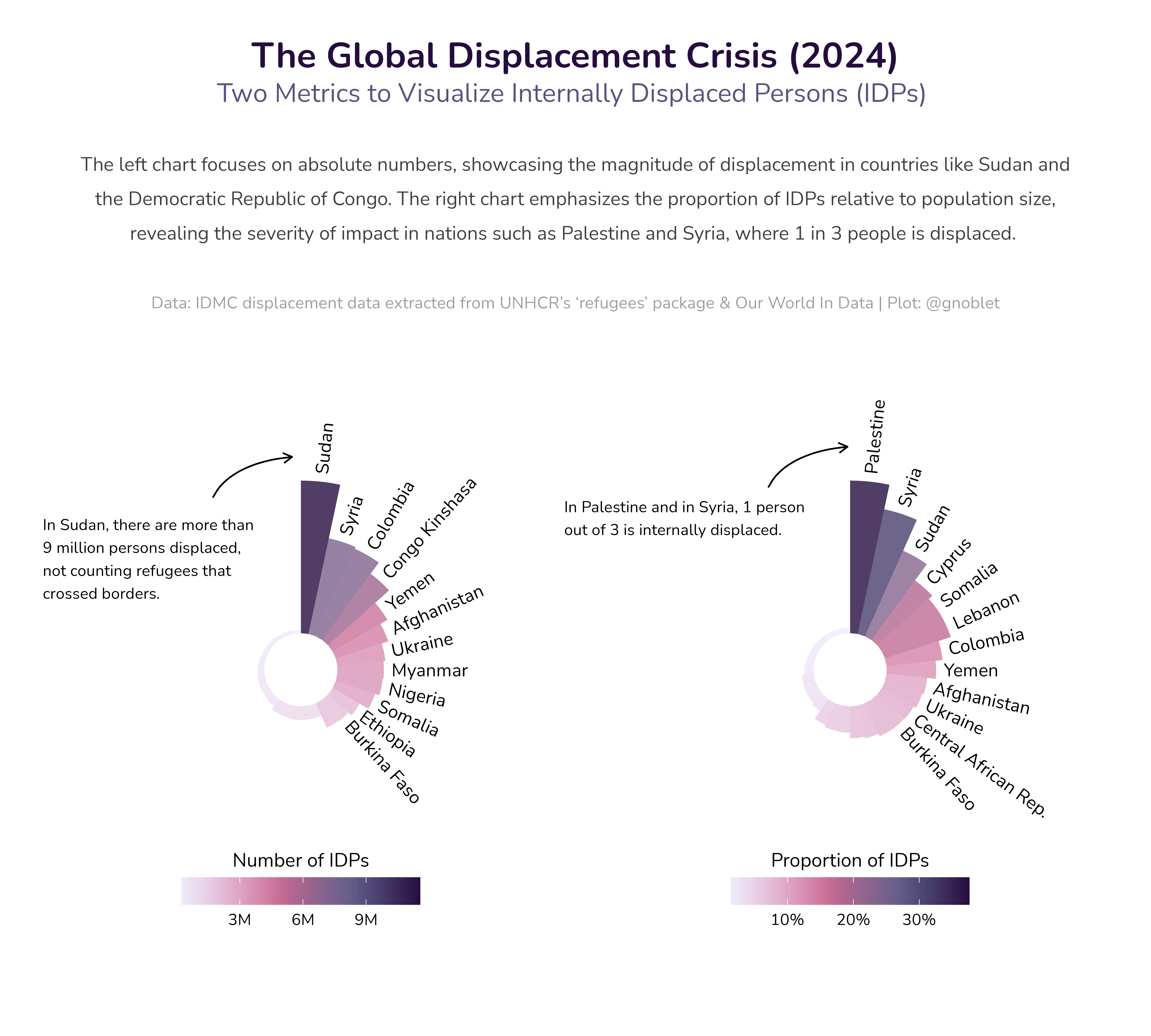
              The left chart focuses on absolute numbers, showcasing the magnitude of displacement in countries like Sudan and the Democratic Republic of Congo. The right chart emphasizes the proportion of IDPs relative to population size, revealing the severity of impact in nations such as Palestine and Syria, where 1 in 3 people is displaced. <br> </span><br>
              <span style='font-size:14px; color:#9E9E9E;'>Data: IDMC displacement data extracted from UNHCR's 'refugees' package & Our World In Data | Plot: @gnoblet</span>",
    theme = theme(
      plot.title = element_textbox_simple(
        family = "Nunito",
        size = 20,
        hjust = 0.5,
        halign = 0.5,
        # no margin below, even negative
        margin = margin(
          l = 30,
          r = 30,
          b = 0,
          t = 10)
      )
    )
  )

create_annotation <- function(curve_x, curve_xend, curve_y, curve_yend,
    text_x, text_y, label, text_width = 30) {
      ggplot() +
        geom_curve(
        aes(x = curve_x, xend = curve_xend,
        y = curve_y, yend = curve_yend),
        curvature = -0.3,
        angle = 120,
        arrow = arrow(length = unit(0.01, "npc")),
        linewidth = 0.5
        ) +
        annotate(
        "text",
        x = text_x,
        y = text_y,
        label = paste(strwrap(label, width = text_width), collapse = "\n"),
        size = 3.5,
        hjust = 0,
        family = "Nunito"
        ) +
        theme_void() +
        coord_cartesian(xlim = c(0, 1), ylim = c(0, 1), expand = FALSE)
}

# Create final plot with annotations
p <- wrap_elements(final_layout) +
  inset_element(
    create_annotation(
      curve_x = 0.67, curve_xend = 0.74,
      curve_y = 0.53, curve_yend = 0.57,
      text_x = 0.49, text_y = 0.50,
      label = "In Palestine and in Syria, 1 person out of 3 is internally displaced.",
      text_width = 36
    ),
    left = 0, right = 1, bottom = 0, top = 1, align_to = 'full'
  ) +
  inset_element(
    create_annotation(
      curve_x = 0.18, curve_xend = 0.25,
      curve_y = 0.52, curve_yend = 0.56,
      text_x = 0.03, text_y = 0.46,
      label = "In Sudan, there are more than 9 million persons displaced, not counting refugees that crossed borders.",
      text_width = 30
    ),
    left = 0, right = 1, bottom = 0, top = 1, align_to = 'full'
  )

# save fig
ggsave(
  "day_03.png",
  height = 9,
  width = 10,
  dpi = 600,
  type = "cairo-png"
)